

How to Become a Super Duper Data Researcher: Look at Statistical Cohorts
By Kellie Kelly
It looks like the November School Board Election is ramping up to be quite the event of the season in our Fishers community! There are two very different philosophies currently concerning the focus and future direction of public education. Both sides are presenting data and charts to support their claims. How can a parent decide which data is the most accurate? Well, here are some tools, definitions, and basic statistical nuggets of information to help you be a super duper data researcher when encountering all the charts and graphs for your child’s school.
Let’s first discuss the definition of cohort. We are all familiar with the use of the word “cohort” from the days of Covid. We were told to stay within our own little cohort, or group. But, the statistical definition of “cohort” is different. When a statistician does cohort analysis that means they are looking at the same population over a specific period of time. And this population has a characteristic in common, usually birth year. Or in terms of educational statistics, a cohort is usually when a group of students first enters a school or college. For example, all freshmen entering high school this year can be called the Cohort of 2026, since these students are all in the graduating class of 2026.
Statistical cohort analysis is key to understanding student performance and to improving student learning outcomes. When we study the same group of students over a specific period of time, patterns emerge. These patterns help to identify specific educational needs. The needs then should be addressed and strategies implemented to correct any deficits in learning.
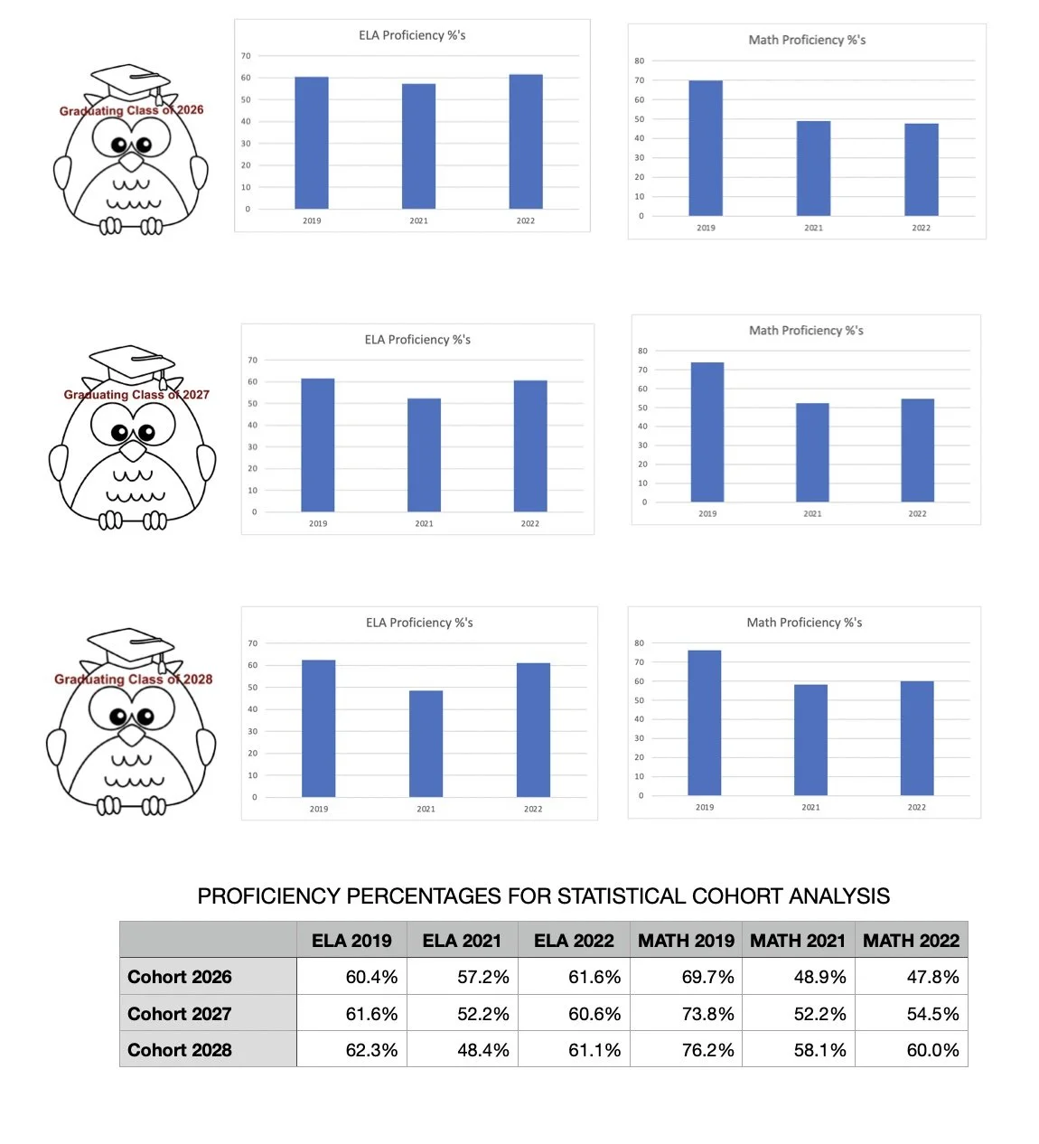
The following charts look at statistical cohort data for the HSE graduating classes of 2026, 2027, and 2028. The data shown is from the ILEARN test which is given in grades three to eight. ELA stands for English/Language Arts. The proficiency percentages show the percent of students at or above grade level. Looking at the charts do you see any patterns?
If you look at the ELA charts, do you see that the bar charts on the far left for 2019 are taller than the bar charts for 2021? Then the charts go back up from 2021 to 2022. What this means is that there were fewer students proficient in ELA in HSE schools after 2019. (There was no ILEARN test for 2020, due to Covid.) A good guess for the drop in proficiency percentages from 2019 to 2021 would be Covid Learning Loss. Then the chart goes back up for 2022! If you trace the tops of the charts you make a “U” figure. And the “U” pattern is the same for all three cohorts. This is quite revealing. It shows that for all three cohort groups there is improvement in student learning outcomes for English/Language Arts.

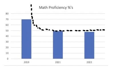
If you look at the Math charts, what figure can you trace from the tops of the bar charts? It starts out high in 2019, decreases in 2021, then stays relatively flat for 2022. The figure resembles an ‘L”. So, what this means is that HSE had more students proficient in math in 2019 (pre-Covid). Then the numbers dropped, and the numbers haven’t started to get much better. We aren’t seeing much progress at all in recovering from Covid Learning Loss in Mathematics. And this same pattern holds true for all three cohorts.
STATISTICAL COHORT ANALYSIS FOR HAMILTON SOUTHEASTERN SCHOOLS USING PROFICIENCY PERCENTAGES IN ELA AND MATH FROM THE ILEARN ASSESSMENT
Since Statistical Cohort Analysis is such an important tool to identify specific educational needs for our students, the question we must ask the HSE Administration is: “Have you been looking at the Statistical Cohort Analysis Data to determine an action plan to help HSE students recover from Covid Learning Loss?”